
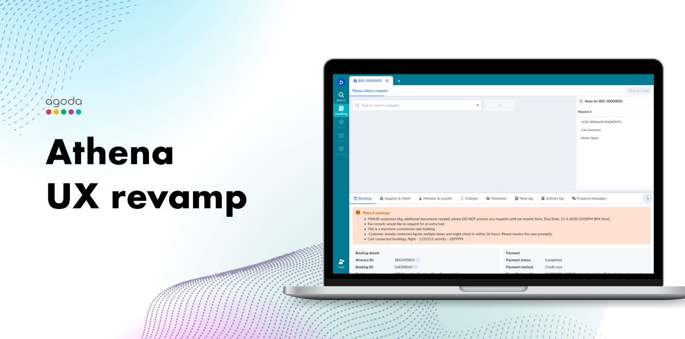
Athena UX Revamp
To revamp the product and make the case handling efficient and user friendly
Date
Jan 2023 - Oct 2023
Role
Product designer
Responsibility
- Discovery of all problems
- Synthesis of problems/pain points holistically based on user journey
- Organizing workshop and facilitating ideation with stakeholders, engineers, users & designers
- User validation and qualitative data collection with UX researcher
- Design of product including all the iteration
Background
Agoda
Agoda is online travel platform, helps travellers book hotels and properties worldwide, plus flights, activities, and more. Agoda.com and the Agoda mobile app are available in 39 languages and supported by 24/7 customer support.
CEG
Customer Experience Group (CEG) is essentially our support center team. Our team assists our customers and partners with their post-booking questions and requests. CEG is very special as it is the only team in Agoda that deals directly with our customers.
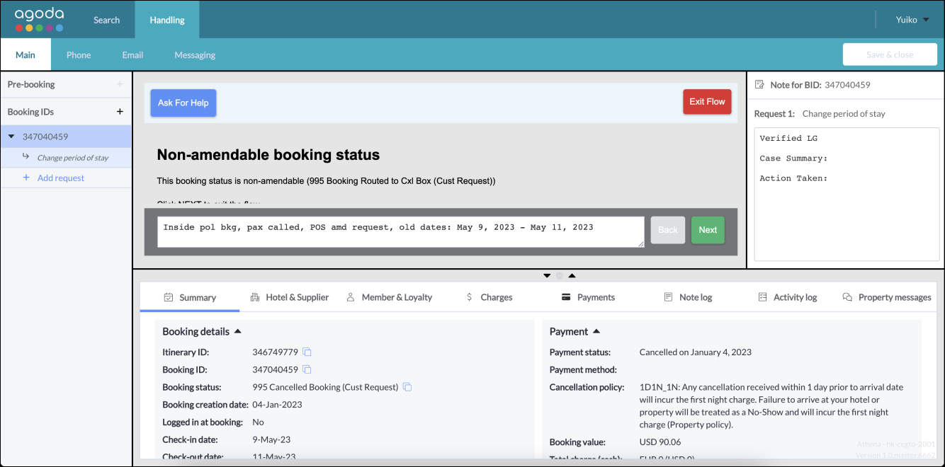
Athena
Athena is a case management system used by customer service department of Agoda. It is used to handle tickets from our hotel and customers. Athena is a new in-house tool that replaced legacy tools like TOBO(Travel Operations Back office) in efforts to consolidate the various tools CEG agents use (1 CEG 1 Tool).
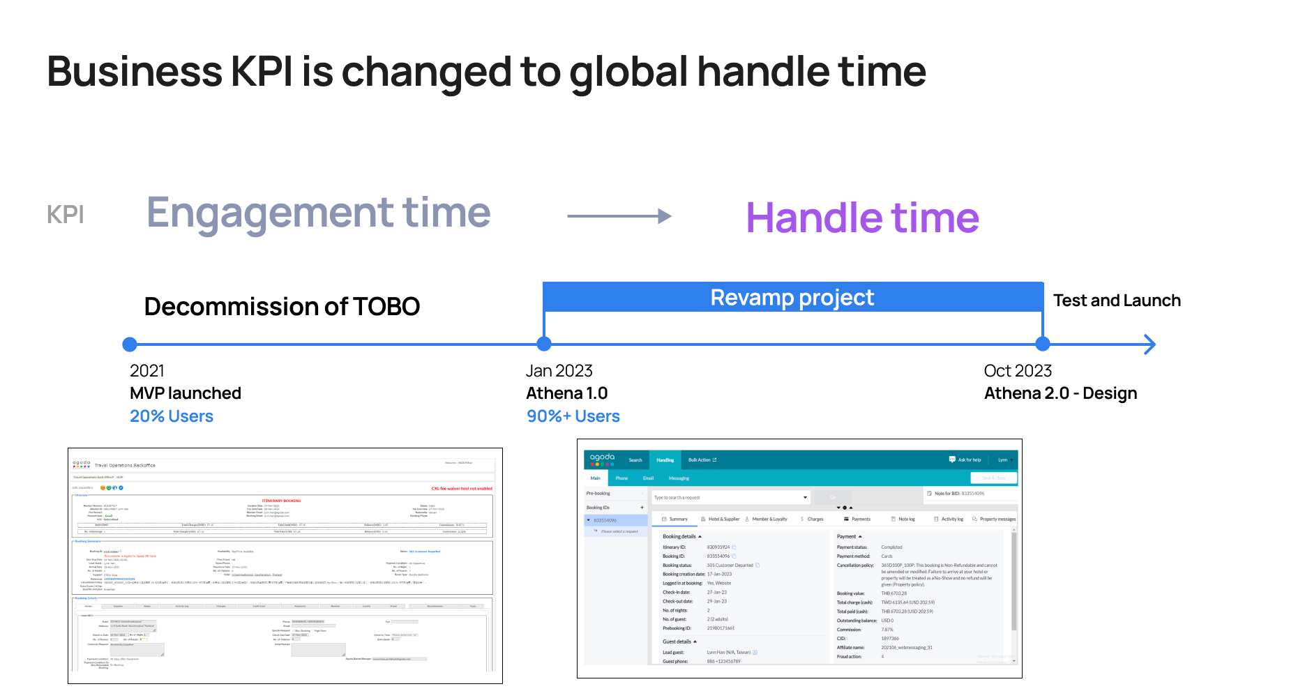
Why to revamp?
Currently, we are wrapping up the consolidation of main functions from legacy tools into Athena. We will decommission TOBO Booking List (legacy tool) by migrating the functionality all to Athena. Though migration's being finished, yet the new tool UX and its information architecture are still remaining to be reorganized and revamped.
KPI
Global Handle Time (GHT) of agent: overall time used in the case handling
Cost saving: 1% GHT ≈ 0.9 million USD
Cost saving: 1% GHT ≈ 0.9 million USD
Finding UX problems
Survey
In order to find the problem area, we sent a UX audit survey to all the agents by the end of Q4 2022. Among the result we got, there are 1299 suggestion/feedback on improvement, within which 162 are under the category of UX.

User feedback synthesis
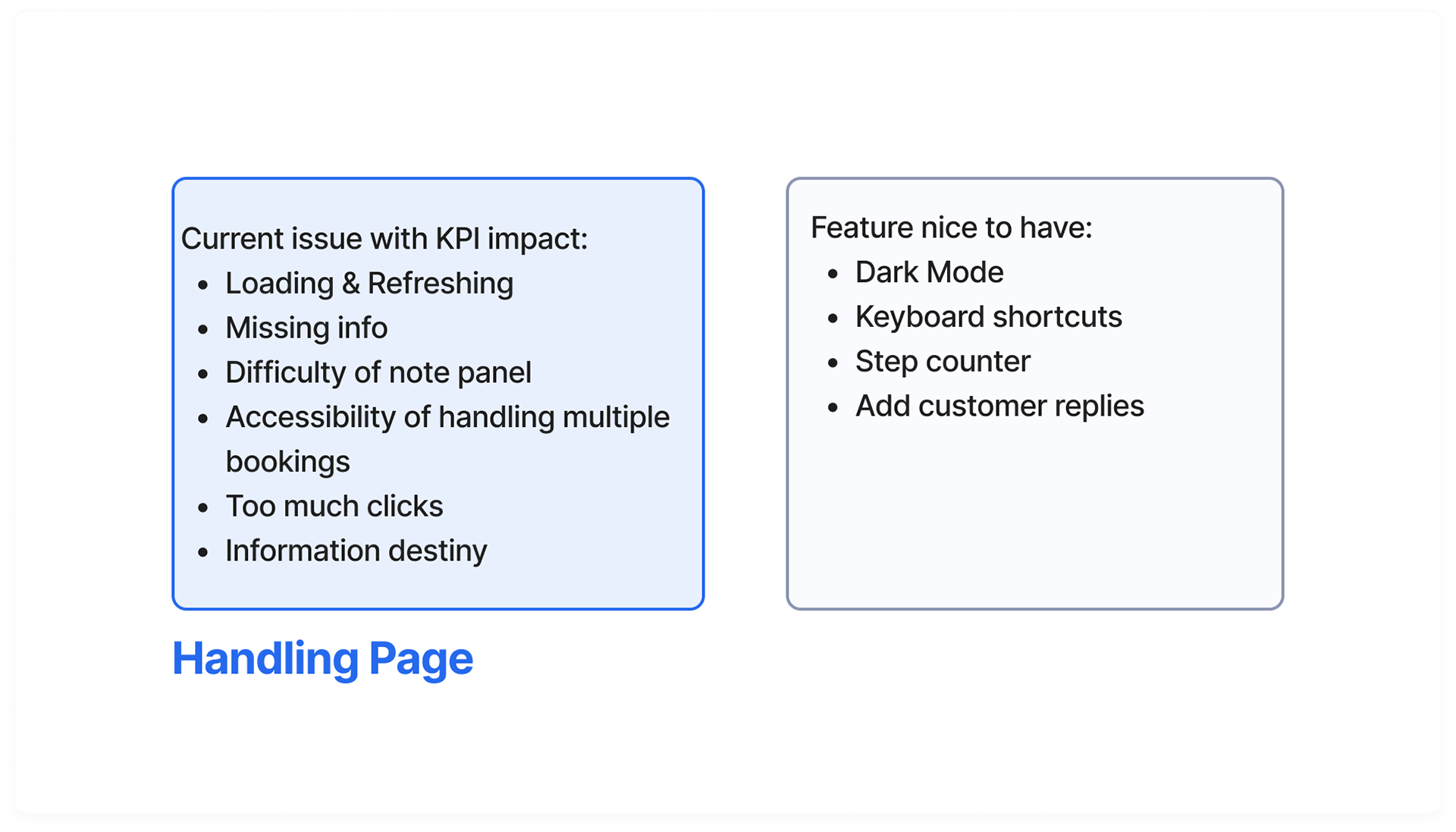
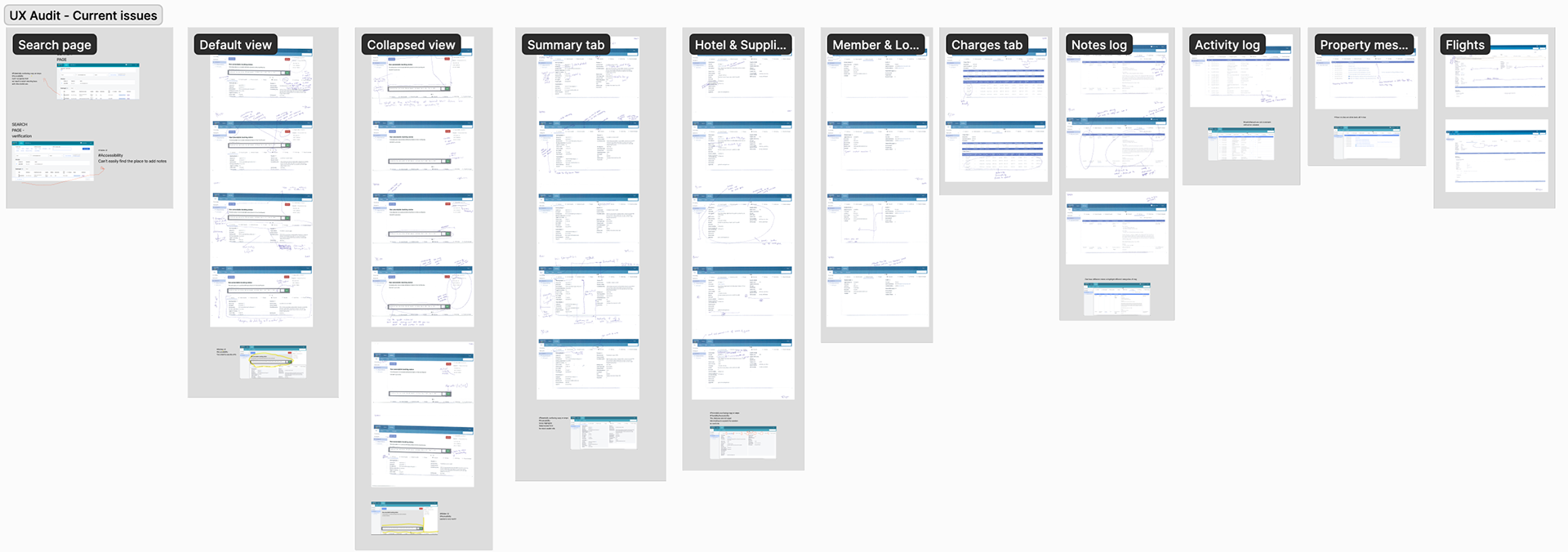
After synthesis, we found issues raised by users. All the problem raised are concentrated in the Handling page.
UX audit - heuristic
We've also conducted internally with designers, product manger and researcher on current ux problems. We've also found out that the most problematic area is the handling page.
all marked are suggestion/issues
Problems
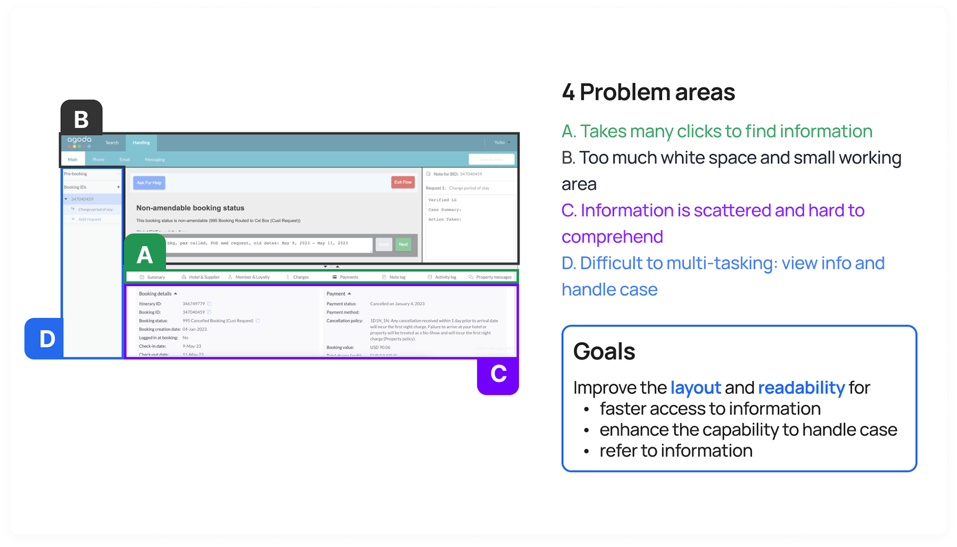
According to the survey and UX audit, most of UX issues are located in the handling page.
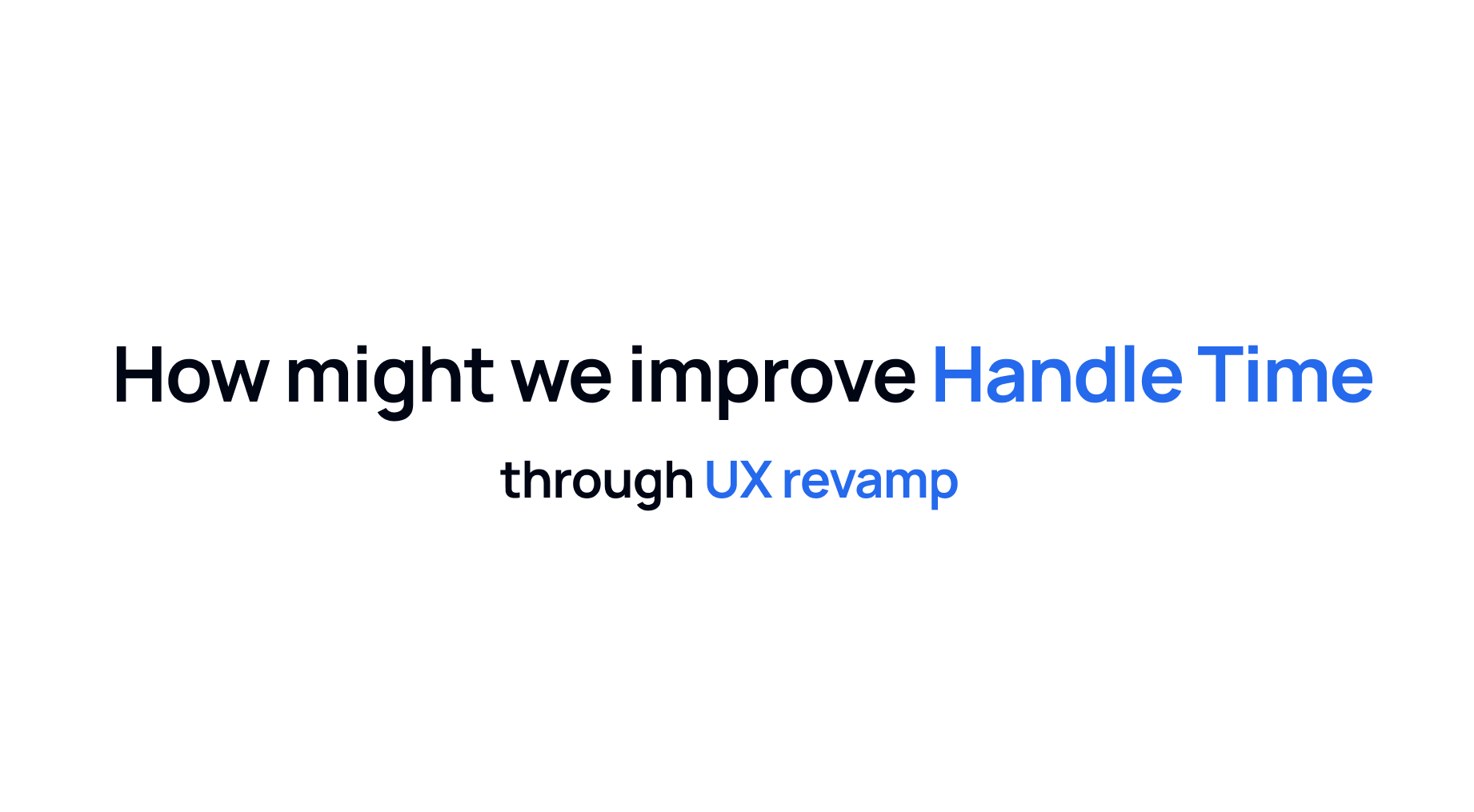
Design Solution
How might we improve layout?
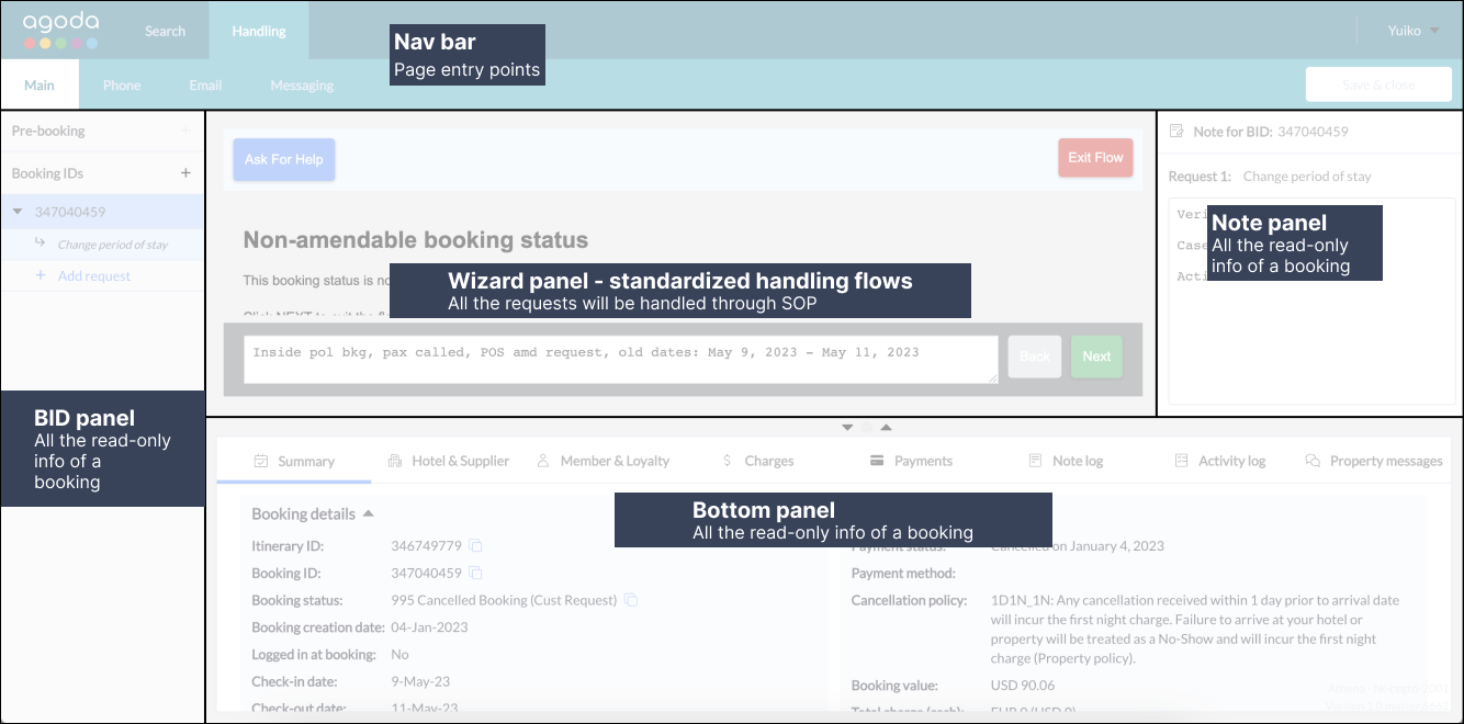
1. Utilization of real estate:
- BID list and Nav bar optimization
- Panel resizing behavior optimization
2. Efficiency of loading & searching info: Pagination to one scroll
How might we improve readability?
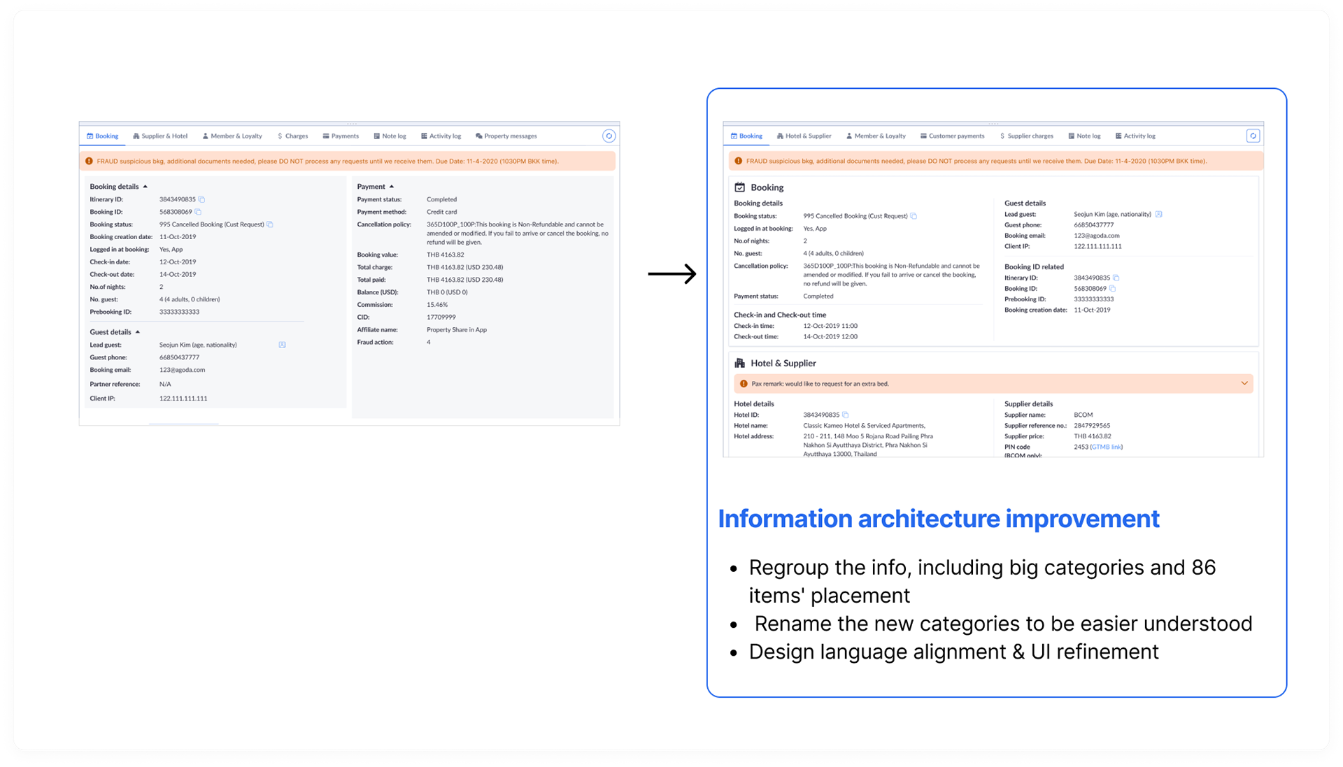
Information restructure & visual enhancement
Layout Improvement
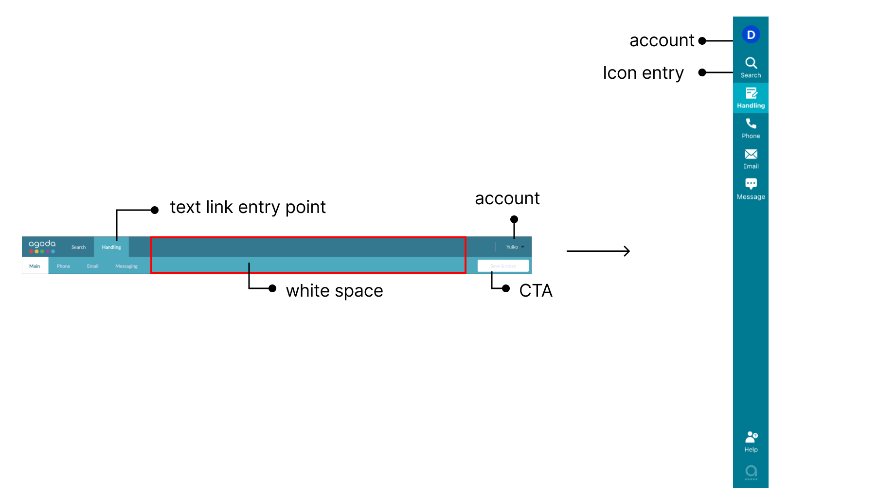
1.1 Utilization of real estate: BID list and Nav bar optimization

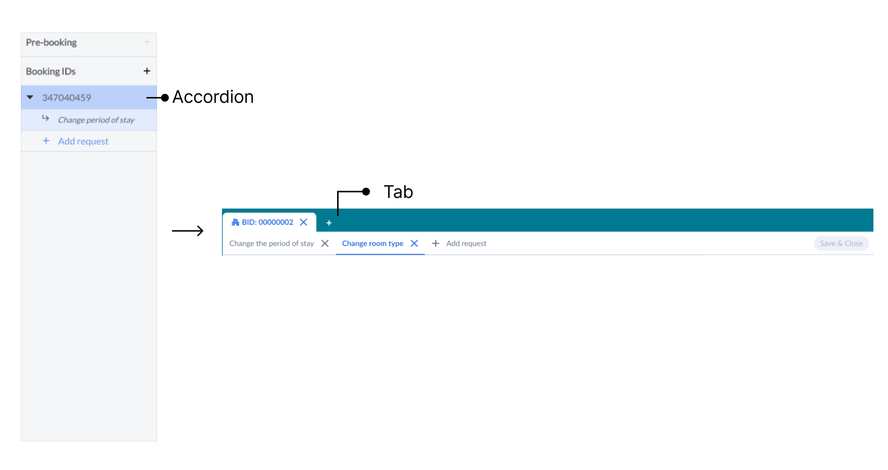
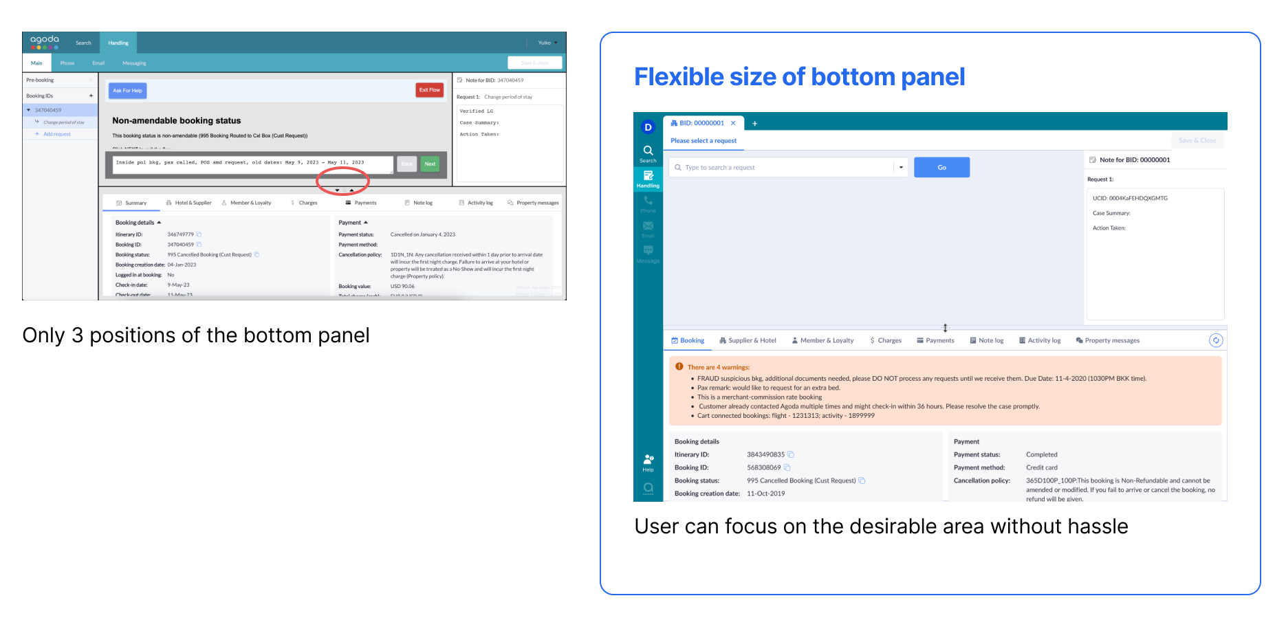
1.2 Utilization of real estate: Panel resizing behavior optimization
2. Efficiency of loading & searching info: Pagination to one scroll

Readability Improvement
Information restructure & visual enhancement
Content:
There are 8 categories in the bottom sheet with 86 items (each table as an item) in total under them. The categories are: summary, hotel&supplier, member&loyalty, charges, payment, note log, activity log, property message.
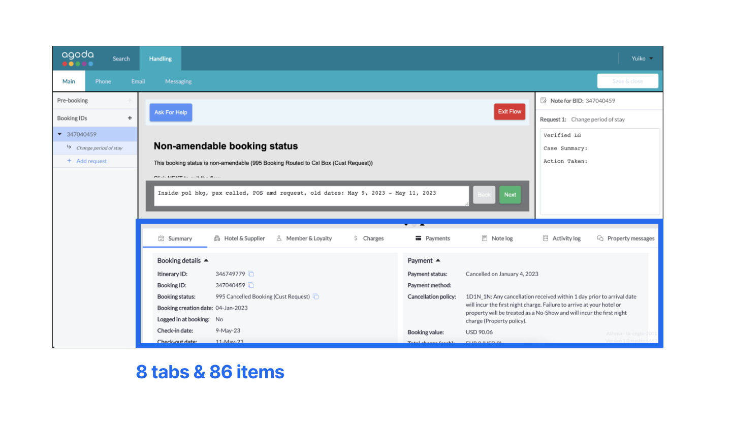
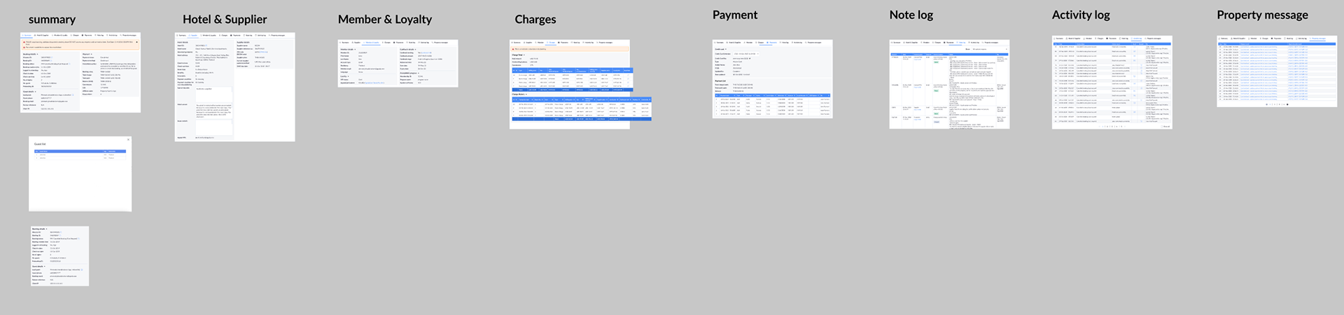
Dissection of all the categories

Research Result
Here we used 3D clustering visualization of the card sorting result, combining with feedback from FGD validation, we concluded the new categories and renamed some of them.
The new categories now are :Booking, hotel&supplier, member&loyalty, charges, payment, note log, activity log

[8] How we concluded the new categories
Action item:
1. Regroup the info, including big categories and 86 items' placement
2. Rename the new categories to be easier understood
3. Design language alignment & UI refinement
Design change of phase 2
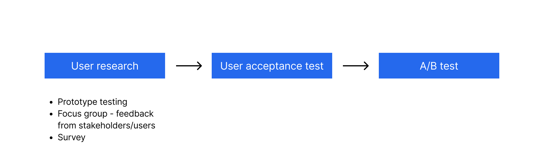
Validation approach
Final outcome
Through this UX revamp project, the agent cost was saved 0.9% GHT in total, equivalent to 810,000 USD.